After recently training a client on how to use their new bbPress-powered site, I discovered that the default admin menu icons for bbPress are not very intuitive and the client found them slightly confusing:

They are (I think) a beehive, a honey dipper and a bee. That second one took me a little while to figure out – at first I thought it was a paintbrush. For a client who couldn’t care less that the name of the forum software is ‘bbPress’ (which I assume is the reason for the bee references), these icons are a bit weird and unintuitive.
My solution was simple – replace them with icons from WordPress built-in dashicons collection:
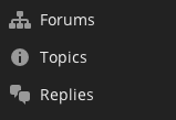
These, I’m sure you will agree, make a lot more sense and make the admin menu just that much easier to navigate for a user who has never encountered WordPress before.
Here’s the CSS I used that changed the icons – just add this to your theme, make sure to load the CSS in the dashboard and you’ll be good to go:


Leave a Reply